
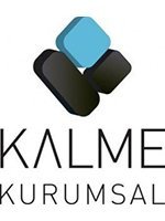
The letter K in our logo reaches for the sky and peaks in the middle showing the high goals of our company.
The black coloring in our logo displays Turkey as the corporate and significant structure, a point between the West and the East, while the blue coloring refers to transparent, balanced and close amity that this point encompasses.
The balanced position of the logo on a black and corporate structure shows the stability that our company ensures, whereas the structure in blue expresses that the stability is maintained by transparency as well as our corporate structure.